# Viskhan Khasiyev
> Design engineer in Antwerp and a professional maker across design, code and automation. Currently at Bundl, with recent client involvements including Nestlé, Lilly, Chanel and Gore.
This file contains the full content of https://khasiyev.com as one markdown document. The link index lives at https://khasiyev.com/llms.txt.
---
# OBSN
Section: Client work
Published: 2026-09-14
Role: Creative Developer
Clients: Steven.com, Authentic Brands Group
Live site: https://obsession.com
Case study: https://khasiyev.com/work/obsn
Obsession is a joint venture between Steven.com, Steven Bartlett's creator-economy holding company, and Authentic Brands Group: media, events, a network and a venture arm under one mark, OBSN. The site is the launch platform, live from 14 September 2026 with one call to action, join the list. My part was the top of the homepage: a five-frame scroll story the team calls the rewind. The video above is the fold with the interface hidden, the world on its own.
## The rewind
Every creator started with one thing. The fold takes that line literally and runs a creator's career backwards. A follower counter starts at 1,000,000 and counts down to zero, one room per scroll stop.
The eclipse first: the O mark as a sun on the bottom edge of the screen, alive under the pointer. Scrolling dives into the disc. Before the arena, a wireframe stadium with a drone, cameras and a mic hurtling past the lens. Before the team, a studio: ring light, two chairs, headphones, a notebook, an iPad. Before anybody was watching, the bedroom: MacBook, LED lamp, USB stick, post-its. The scroll stops once more at the bedroom door as it cracks open, then the last swipe lands on the line the page was written for. There was one thing: obsession.
The colour runs as a single vortex from scene to scene, amber in the arena, Absolute Orange in the studio, deep red in the bedroom, ember at the landing.
## The build
Built with agentic coding on top of the team's Next.js 15 repo: React 19, three.js through React Three Fiber, drei and postprocessing. The preloader counts 000 to 100 on what the first frame actually needs while the O mark assembles, so the sun is formed by the time the page hands over.
## The same story on a phone
Effect tiers per GPU, full, mid and lite, so a phone plays the same five rooms with a lighter pass. A Reduce motion switch sits in the header for anyone who wants the story without the flight.
---
# OBSN at Lightbox NYC
Section: Client work
Published: 2026-09-13
Role: Creative Developer
At: Lightbox NYC, Manhattan
Clients: Steven.com, Authentic Brands Group
Case study: https://khasiyev.com/work/obsn-lightbox
Obsession launched on 14 September 2026 with a night at Lightbox NYC, a room in Midtown Manhattan whose four walls are one 360° projection surface. The venue piece came to me with a day to go: a loop of about a minute for the four walls, delivered as four files cut to the venue's wall templates, due the next afternoon. The video above puts the finished walls back into a model of the room.
## One world at a time
The loop is the fold from the site, taken off the screen and wrapped round the room. You stand inside the arena, the crowd twinkling on every wall, the drone on its lap overhead. Then the room dissolves into a field of particles, the eclipse closes onto the primary wall with the next world already forming inside its disc, opens again, and the studio draws itself on around you, line by line. Twenty seconds later the same pass takes you to the bedroom, and once more back to the arena, so it never ends.
Props glow one at a time while the rest stays dim, which does the work of a spotlight without one. Nothing hurtles and nothing is written on the walls. It plays behind people holding a drink, so every move is slow enough to follow from anywhere in the room.
## Four walls from one camera
The four files are a box render: one camera at the centre of the room, four views at ninety degrees, the venue's own proportions setting the fields of view, so the picture bends at the corners exactly where the walls do. The eclipse is the site's own shader with its screen coordinate swapped for a projection of each pixel's direction in the room, which keeps the disc a true circle from the centre and lets the corona run round the corners.
---
# 113 Spring
Section: Client work
Published: 2026-01-01
Role: Designer & Developer
At: Bundl, Antwerp
Live site: https://113spring.com
Case study: https://khasiyev.com/work/113-spring
113 Spring is an undisclosed brand built around curated products, experiences and events. At Bundl I worked as designer and developer on the production Shopify storefront, together with [Montana Mertens](https://www.linkedin.com/in/montanamertens/), Bundl's senior designer, who led the design. My side was taking the Figma design system through to the custom theme code live at 113spring.com.
## The storefront
The site carries an editorial calm that is easy to sketch and hard to keep in a real store: full-bleed film stills, a restrained palette, and typography doing most of the work. That calm is Montana's design; building the theme meant her quiet details survived contact with production, from the navigation rhythm down to the product grid.
## A theme that scales past launch
Underneath, the build is the same scalable component system as OLEUS: pre-built, configurable sections the team composes into new pages in the Shopify editor. The calm holds because the system enforces it, page after page, campaign after campaign, with no developer needed for the next landing page.
## Details that carry the brand
The preloader film above is one of those details. Small moments like it set the tone before a single product appears, and they only ship when design and build stay close.
## Credits
Shout out to [Montana Mertens](https://www.linkedin.com/in/montanamertens/) for the great design work that carries this storefront, and to [Jan Van Fraeyenhoven](https://www.linkedin.com/in/jan-van-fraeyenhoven/) for setting up all the tracking behind it.
---
# OLEUS
Section: Client work
Published: 2025-05-01
Role: Designer & Developer
At: Bundl, Antwerp
Clients: Nestlé
Live site: https://oleus.com
Case study: https://khasiyev.com/work/oleus
OLEUS is a Nestlé venture: mitochondrial health shots rooted in Swiss science. Through Bundl I joined as designer and developer on the production storefront, working alongside [Montana Mertens](https://www.linkedin.com/in/montanamertens/), Bundl's senior designer, who led the design, from the Figma design system to the custom Shopify theme code running at oleus.com.
## From Figma system to theme code
The storefront runs on a fully custom Shopify theme. Montana led the design; my work sat on both sides of the usual handoff, extending pages in her Figma system and building them as Liquid sections and templates. Staying close to both ends meant the design intent survived all the way to production, down to the type scale and the easing curves.
## A system the team can build with
The theme is a scalable component build, not a set of hard-coded pages. Every section ships as a reusable, configurable unit with its own schema, so the brand team assembles new pages and campaigns straight in the Shopify editor. Layouts stay on brand without a developer in the loop, because the guardrails live in the components themselves.
## Built to sell, not to demo
This is a live store with real customers, real product data, and a review count that keeps moving. Every design decision had to hold up against changing content and a running catalog, not a frozen staging environment. That constraint shaped the system more than any moodboard did.
## Credits
Shout out to [Montana Mertens](https://www.linkedin.com/in/montanamertens/) for the great design work this storefront is built on, and to [Jan Van Fraeyenhoven](https://www.linkedin.com/in/jan-van-fraeyenhoven/) for setting up all the tracking behind it.
---
# Venture Design at Bundl
Section: Client work
Published: 2025-03-01
Role: Venture Designer & Developer
At: Bundl, Antwerp
Clients: Gore-Tex, Lilly, OLEUS (Nestlé), Chanel, Liberty Global
Case study: https://khasiyev.com/work/bundl-venture-design
At Bundl, I work as a Venture Designer & Developer embedded in fast-moving venture sprints. Each engagement takes a strategic idea and turns it into something real: a brand, a prototype, a go-to-market kit, or all three at once.
## Client Involvements
## What I do
The work spans design, development, and strategy simultaneously. At Bundl there's no clean separation between the three: you're shaping the strategy while designing the site while building the product. That's both the difficulty and the part I find most interesting.
**Design.** Web design, landing pages, and a high volume of ad visuals. AI video and image generation, video editing, email marketing. The goal is always the same: make the strategy visible and credible.
**Development.** This has grown from MVPs and prototypes into production builds, fully custom Shopify themes included. More recently we build everything from scratch: Next.js for the web, Swift, React Native and Electron for native apps. With AI in the loop, the bottleneck on how much of that I can carry alone has vanished.
**Strategy.** Venture sprints are too fast for a strategy-to-design handoff. I'm in the strategy conversations from the start, so the design and the build never have to guess why the venture exists or who it's for.
## AI workflows
This is a newer part of the work, but one that's growing fast. I've been integrating AI into both the design and development side of sprints:
**Agentic coding** sits at the core of how I build: CLI-first workflows, **MCP servers** that connect agents to the tools and data a project lives in, and **knowledge management systems** that keep context persistent from sprint to sprint.
This space moves faster than any sprint cycle. People sometimes ask how I stay up to date with it, and the answer is that I don't have to try: pushing AI hard through every piece of work keeps me current automatically. The rest of the job is knowing when to use it.
## What it actually looks like
Each sprint is different. Sometimes I'm the only designer and developer on the project, covering everything from the first design exploration to the deployed landing page. Sometimes I'm working alongside strategists and project leads, translating their work into something visual.
What doesn't change: the expectation that every problem is solvable, the pace is fast, and the output has to be good enough to put in front of serious stakeholders. That pressure is something I've come to appreciate.
---
# Tesla Blender Project, remastered
Section: Lab
Published: 2026-09-27
Case study: https://khasiyev.com/lab/cybertruck-remaster
In 2024 I spent three weeks on my first ever Blender project: a Cybertruck rolling out of a bunker on Mars. Modelling, texturing, animating, all by hand and all new to me. [The original is still here](https://khasiyev.com/university/tesla-blender). I was proud of it back then. Looking at it now, it's kind of wack.
So I gave it to Opus 5.5 with one message: "couple of years ago i made this blender render and its kinda wack now. keep the story, the bunker, the domes, starship on the horizon, but rebuild everything else. the models, the scene, the animation!! it shouldnt feel like a 3d render, it should feel like a film someone actually shot on mars. heavy, quiet, a bit of dust in the air. this is not a short task, loop until you make something awards worthy".
## Everything is code
It started by reading my old renders, the styleboard and the sketch sheet, and kept the story: nine shots, the bunker, the greenhouse domes, the solar field, the door, the drive-out, Starship on the horizon. Then it rebuilt all of it without once opening Blender's interface. The truck is cut from planes and checked against the side view in Tesla's owner's manual. The terrain is a heightfield, the rocks are scans scattered with geometry nodes, and the domes are geodesic glasshouses with lettuce growing in the racks. Even the soundtrack is synthesised in Python.
That's the part that gets me. Nothing in this film was placed by hand. Around 60 scripts rebuild the whole scene from source, so any shot can be changed and rendered again.
## Where I steered
I didn't write any code, but I didn't sit back either. My part turned into art direction. "the wheels look like plastic. rubber is matte and dusty, only the rims should catch the light." "the dust looks fake, real dust hangs low and trails behind the wheels, and the sun should come through it." "the animation is stiff. something this heavy should settle into its suspension when it stops, nothing moves at a perfectly even speed." Every note went back into the loop, and the next pass came back better.
On the first day up to six sessions ran side by side: one on the truck, one on the wheels, one on the capsules, one on the hangar interior, one on the bunker gate and one stitching it all together.
## Post-processing
For the finish I switched to goal mode, where you set a goal and the agent keeps looping until it's met. Those passes ran on Fable 5.1, with goals like "make it look shot, not rendered. think anamorphic sci-fi like dune and interstellar: deep blacks, the sun blooming a little too much, grain you feel more than you see". Instead of Blender's compositor it wrote its own finishing chain in Python, in the order a camera, a lab and a colourist would apply it: per-shot exposure and white balance, a graduated ND on the sky, lens glare, anamorphic streaks, red halation around the light bar, a log grade with a split tone, then grain. Drag to compare the raw render with the delivered frame.
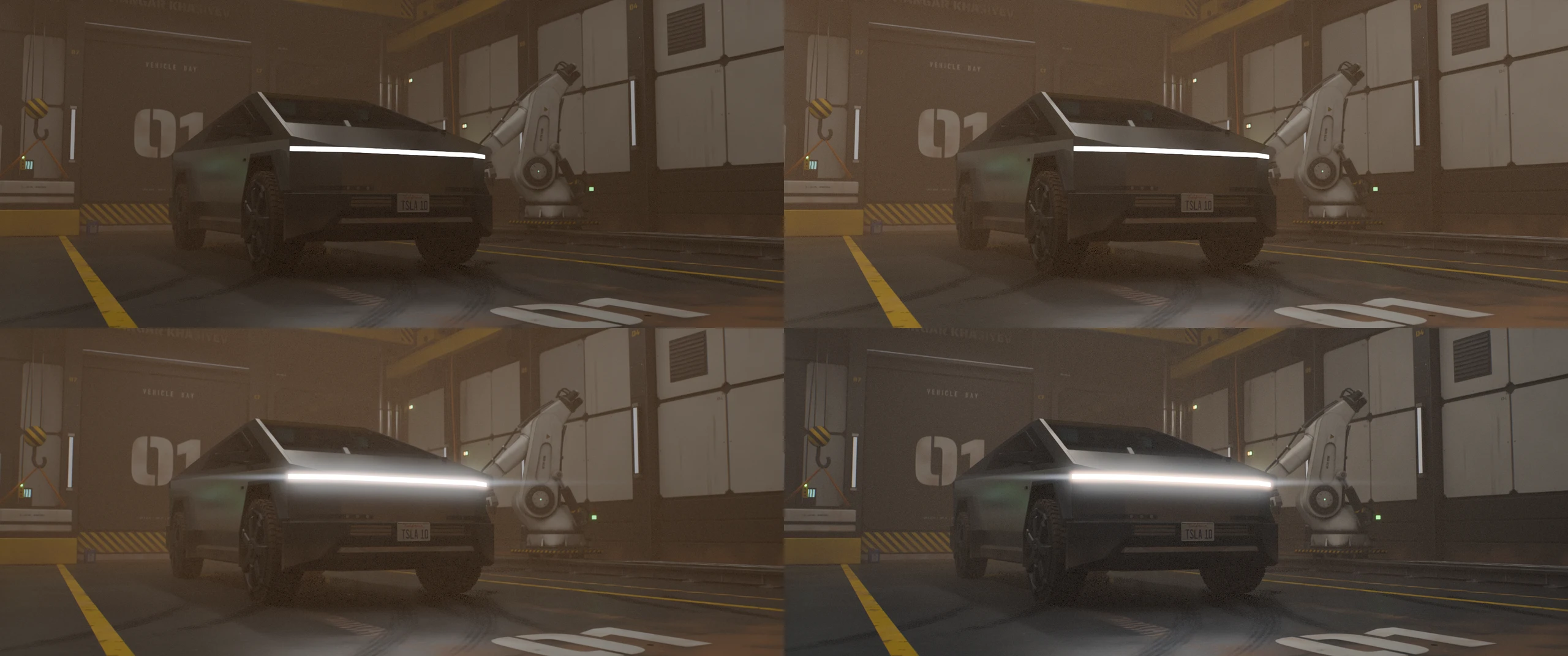
The same frame through the chain: raw render, then exposure and white balance, then lens and halation, then the print grade and grain.
## Behind the scenes
The whole film was made headless: no window, just scripts driving Blender from the terminal. Open the files in Blender afterwards and the scene is all there, with real node trees, real materials and all nine shot cameras on the timeline.
The dust was the hardest part. The first version was 36 overlapping puffs that looked fake and took 40 of the 60 seconds each frame needed to render. It got replaced by a single volume, which looks better and renders faster.
- About 46 hours from my first message to the final film
- Around 2,100 tool calls, 27 messages from me
- 60 Python scripts, close to 19,000 lines
- 815 frames at 2.39:1, rendered on an M4 Max in about a day, with the final crane shot alone taking eight hours
- Score and sound design synthesised from scratch, no samples
- Scanned textures, rocks and skies from Poly Haven (CC0)
Three weeks in 2024, two days in 2026. I wrote down [what that does to my view on AI](https://khasiyev.com/blog/where-i-stand-on-ai).
---
# Portfolio v1
Section: Lab
Published: 2025-01-15
Case study: https://khasiyev.com/lab/portfolio-v1
Before this site existed, I built a first take on my portfolio in Webflow. One dark, cinematic opening scene: a stretched wordmark sinking into the terrain, a ship drifting overhead, scanlines across the whole frame.
## Never shipped, still worth sharing
It never went live. By the time the header was where I wanted it, my idea of what a portfolio should say had moved on, and this stayed a concept. I'm sharing it anyway, because it was a genuinely fun build and it still holds up.
What stuck with me is what it did to my view of no-code platforms. This was my first real project in Webflow, and the entire scene came together inside the designer, without writing a line of code. That kind of speed changes how you prototype: you can chase an atmosphere instead of an implementation. It opened my eyes to how much these tools can carry on their own.
---
# Tesla in Blender
Section: University work
Published: 2024-11-01
Case study: https://khasiyev.com/university/tesla-blender
Third year. This is what I ended up with after three weeks in Blender, coming in with zero 3D experience.
I picked Tesla as the subject because the geometry felt interesting: clean surfaces, deliberate proportions, good lighting potential. The project was whatever you made of it; I wanted to see how far I could push the render in three weeks. What followed was a crash course in everything simultaneously: modeling, materials, lighting setup, camera angles, render settings, compositing. All new, all at once.
Devine had trained me to figure things out without being told exactly how, which turns out to be genuinely useful when the software is as deep as Blender. You can't learn it linearly, you start making things, hit a wall, figure out what you're missing, and keep going. That's mostly how this went.
One thing that helped more than I expected: I had done some physical sculpting when I was younger. There's something about thinking in three dimensions that was already familiar even if the software wasn't. Getting geometry to sit right, understanding how light wraps around a curved surface, some of that translated in a way that surprised me.
The result isn't perfect. But it's a real result, made in three weeks, with a tool I'd never touched before. I'll take it.
## What I learned
3D design requires a different mental model than flat design. You're not making something look right in one view, you're building something that exists in space and then choosing how to observe it. The lighting, the camera, the materials, the geometry all interact in ways you have to discover through experimentation. It's a good discipline to have and one I'd like to go deeper on.
In 2026 I handed this project to an AI agent and let it rebuild the whole thing from code. [See the remaster](https://khasiyev.com/lab/cybertruck-remaster).
---
# Scapino Ballet Rotterdam
Section: University work
Published: 2024-06-19
Role: Development
Clients: Scapino Ballet Rotterdam
Case study: https://khasiyev.com/university/scapino
Scapino Ballet Rotterdam is a historic dance company with an audience that skews older and affluent. The brief asked for a product that uses the educational and social side of dance to reach people in their twenties, with one condition attached: research the problem first, then design and code a working solution. I worked on the development side of the answer, an interactive poster that runs on a webcam and a vertical screen.
## The research
Desk research into Scapino's own channels and an online survey among twenty-somethings pointed the same way. Visual appeal and exposure were not the problem. The gap was personal relevance: nobody in that age group saw themselves in modern dance. Two personas and one how-might-we question came out of the analysis: how might we make people in their twenties connect with modern dance, so that they attend a performance at Scapino Ballet? Three motivators carried the concept from there: personal relevance, shared experiences and authentic storytelling.
## The concept
A poster that talks first. It stands where the audience already is and opens with a dancer's story instead of a season programme. Would you quit a top-tier company to be free? She did. Put your hands up and she tells you how. Once the story lands, the poster turns the question around: how far would you go to chase your passion? The answer is not typed. It is drawn.
## Hands as the interface
The poster runs as a web app inside an Electron kiosk shell, with ml5.js reading the visitor's hands through a webcam above the screen. There is no touch and no menu. A thumbs up or down answers a yes-or-no, holding both hands together for three seconds starts the generator, and the distance between two open hands drives the artwork: the further apart, the longer the word FAR stretches and the more brush strokes land on the canvas. Every gesture shows a visible timer so people know the poster is listening, and a marker on the floor tells them where to stand.
## Art you can take home
The session ends with the visitor's own artwork on screen and a ticket coming out of a printer beside the stand. The ticket carries the artwork, the sentence they made and a QR code to a companion website, where the dancers' stories continue and a performance ticket is one tap away. A physical object made in public is the kind of thing people show to friends, which is exactly the shared experience the research asked for.
## Tested in the room
We tested it ourselves first, then with users on the real setup, and changed the build after each round. The clip below is the final prototype from testing day.
---
# Mixbox
Section: University work
Published: 2024-06-01
Case study: https://khasiyev.com/university/mixbox
End of year two, and this was the final design project. Mixbox was about stepping back from single-deliverable projects and thinking in systems.
The main focus was app design, but you couldn't design the app in isolation, you had to build the brand around it first. Visual identity, packaging, typography, color, the whole system. Only once that was defined did the app screens actually make sense as part of something coherent. The brand constraints you create early become the guardrails that make the design decisions easier later.
That shift in scope is what made this project different from everything before it. It wasn't "make screens that look good", it was "figure out what this thing is, and then make it." That's a harder problem and a more honest one.
## What I learned
Brand systems and product design aren't separate disciplines. The better you define the former, the more consistent and intentional the latter becomes. This was the first project where that relationship was the whole point, and working through it from scratch made the logic of design systems click in a way it hadn't before. It also made clear how much energy gets wasted when you try to skip that step.
---
# Larq Kickstarter
Section: University work
Published: 2024-03-15
Case study: https://khasiyev.com/university/larq-kickstarter
Mid second year, deeper into After Effects. Much deeper.
We'd done the pinball machine the semester before. That was an introduction. This was the real thing. The assignment was to produce a full Kickstarter-style motion graphics video for a product of your choosing. I picked Larq, a self-cleaning water bottle.
The process was the full production pipeline: choose a product, develop the concept, sketch it rough, create still frames, build the motion. Nothing gets skipped. The still frame stage is more important than it looks: you're essentially storyboarding in high fidelity before anything moves, which forces you to commit to timing and transitions on paper before you invest the time animating them.
Getting used to that workflow took time. Motion graphics at this level isn't just making things animate, it's thinking in sequences, building a visual language first in stills and then bringing it to life in a way that feels deliberate rather than busy. I've always liked the Vox YouTube approach to motion: clean movement, data-driven visuals, editorial quality. Some of that found its way into the Larq video. Not a copy but you can see the influence.
## What I learned
Motion graphics is a slow craft. The ratio of planning to execution is higher than in most other design work, and skipping the planning makes the execution fall apart. This was the project where I started to respect that process rather than just tolerate it.
---
# Integration 3
Section: University work
Published: 2024-01-20
Case study: https://khasiyev.com/university/integration-3
End of semester 1, second year. This project did a number on me.
The brief was to design and build a fully responsive website for Train World, the railway museum in Brussels. Full design system, fully responsive development, vanilla JavaScript, and Lottie animations on top of it all. One month.
188 hours total. I counted.
The research phase started with an actual visit to the museum, which was a great day before things got intense. Train World has a genuinely interesting mix of visitors: historical locomotives you can walk through, newer rail technology, families, school groups, serious rail enthusiasts, French speakers making up a large portion of the crowd. I did some informal conversations there, observed how people moved through the space, thought about what a website equivalent of that experience could look like. Fast mode for visitors who want quick information, slow mode for those who want to go deeper. An interactive timeline with animations. A locomotive you could drive with keyboard input. The ideas piled up fast, which made scoping hard.
The development side pushed everything I had learned to that point. Full responsive layout across all screen sizes, vanilla JavaScript for the interactive elements, and Lottie animations rendering motion graphics directly in the browser. Not everything made it into the final version. Some of the files I genuinely couldn't find when it was time to put it all together.
## What I learned
There's a version of "ambitious" that teaches you a lot and a version that just runs you down. This was both. The scope, the field visit, the research, the design, the build, all compressed into a month. I came out the other side knowing more than I did going in, and also a bit wrecked. That tradeoff felt worth it at the time and still does looking back.
---
# Conference Lotus
Section: University work
Published: 2023-11-01
Case study: https://khasiyev.com/university/conference-lotus
Also begin of second year, around the same time as Lotus Education. Conference Lotus was a separate brief. Same client, different context. The goal: a user-friendly, responsive website for the annual Lotus Bakeries conference, aligned with their corporate identity.
The main thing I remember about this one is the Figma prototyping. Making a fully interactive prototype across three screen sizes (desktop, tablet, mobile) means a lot of connections between frames, and the prototype view starts looking like something you'd find behind a restaurant refrigerator at the end of a long night. Complete spaghetti. But it works.
Prototyping at that level of detail forces you to think through every interaction, every edge case, every screen state. You can't fake your way through it. If a flow doesn't connect you have to go back and build it. That's uncomfortable while you're doing it but it's the point.
## What I learned
Responsive design isn't just about adjusting breakpoints, it's about rethinking hierarchy and interaction for each context. What works on desktop often needs more than a layout shift on mobile. This was the first time I had to think across all three simultaneously from the start rather than adapting after the fact.
---
# Lotus Education
Section: University work
Published: 2023-10-01
Case study: https://khasiyev.com/university/lotus-education
Begin of second year. The pace went up immediately: more research, more structured process, more presenting your thinking before you were allowed to continue.
The brief was to design a campaign website for Lotus Bakeries, connecting the brand to Flemish education and community involvement, with a peak around International Day of Education. Which is a specific and interesting brief, not just "make a website," but design something that arrives at a particular moment for a particular audience.
What made this project different from first year was the process itself. Before we could actually start designing, we had to research, present to the professors, get approval, and then continue. It felt slow at first. Looking back it made the work more grounded. You can't just open Figma immediately, you have to know who you're designing for and why before any of the visual decisions make sense.
One month total. Really fun project to work on.
## What I learned
Research-driven design takes longer but leads somewhere better. The forced checkpoint before execution meant design decisions had actual reasoning behind them rather than just looking good in isolation. That's a discipline I've tried to carry forward. Not always successfully, but I understand why it matters.
---
# Pinball Machine
Section: University work
Published: 2023-09-15
Case study: https://khasiyev.com/university/pinball-machine
Beginning of second year. We started getting into After Effects and the first project was a pinball machine animation. I genuinely enjoyed this one.
The interesting challenge was trying to mimic the physics of a real pinball machine in a flat animation tool. Timing, weight, bounce: none of it is automatic, you have to build it through keyframes and easing curves and then test it and rebuild it. Getting it to feel convincing took more iteration than expected but that iteration was actually fun. You keep playing the sequence back and asking yourself whether it feels right.
The other thing I got into was using null objects and parenting to animate a robot arm. Null objects in After Effects let you create a hierarchical chain. The arm moves as connected segments rather than independent parts, which is how a real arm works. Getting that to move the way I wanted took some figuring out but once it clicked it was satisfying in a way that pure graphic design work sometimes isn't.
## What I learned
Motion design rewards patience in a way other design disciplines don't always. You can't judge the result until the whole sequence plays, which means a lot of testing and adjusting. This was also the first time I thought seriously about the physics side of animation (weight, gravity, timing) rather than just position and scale. That changes how you approach it.
---
# Integration 1
Section: University work
Published: 2023-06-01
Case study: https://khasiyev.com/university/integration-1
Final project, first year. Integration 1 was the moment where all three pillars of Devine (experience design, visual design, and development) had to come together in one project, from scratch, in one month.
The stack: HTML and CSS, not responsive, some vanilla JavaScript. No frameworks, no libraries. Now that sounds manageable but at the time it absolutely was not. You're designing something and building it simultaneously, making decisions in both worlds, and they don't always agree.
What I remember most is that this was the first time a project felt complete in that way, design and code as one thing rather than two separate steps done in sequence. It wasn't perfect. Definitely not responsive. Definitely some CSS choices I wouldn't make now. But for end of first year it was a real thing.
## What I learned
Building something you designed yourself is a completely different experience from implementing specs. The decisions compound: a design choice creates a development constraint, a development constraint changes the design. Working through that loop from both sides, even at this level, is something you have to do once before it starts to make sense. This was that first time.
---
# Travel Match
Section: University work
Published: 2023-04-15
Case study: https://khasiyev.com/university/travel-match
Also second semester, year one. Travel Match was a different challenge from Bug's Life because the entire experience had to be designed for a tablet. Not something you naturally think about when you spend most of your time designing for desktop or phone.
The concept: a fun travel matching app that would sit in a travel agency for customers to use while they waited or browsed. The interface had to feel intuitive, a bit playful, and something people would actually want to interact with, not just tolerate.
I remember struggling with it at the start. The tablet format felt off: the proportions weren't what I was used to and it was hard to think concretely about how someone's hands would move across it. How far do you reach, what feels natural at that size, how do you make something feel designed for the device rather than just stretched. Some good feedback from the design teachers helped me push through that block and actually get somewhere.
## What I learned
Designing for a specific physical context is different from designing a UI in the abstract. When you know the device, the setting, and roughly who's using it (a travel agency customer, probably relaxed, not particularly invested in the task), those constraints shape a lot of decisions. This was the project where I started to understand what experience design actually means beyond just "making things look nice."
---
# Bug's Life
Section: University work
Published: 2023-03-15
Case study: https://khasiyev.com/university/bugs-life
Second semester, first year. Bug's Life was my first illustration project at Devine and honestly the first time I had ever opened Illustrator seriously. Before this, zero experience with vector illustration. Not even close.
The brief was straightforward enough: take a styleboard and build a visual design around it, then apply it to a website concept. Two weeks. In practice that meant figuring out a visual language from scratch, learning the tool as I went, and somehow having something to present at the end of it.
Looking back I definitely spent too much time on the illustrations and not enough on the website. Classic first-year mistake: you get absorbed in the thing that's new and exciting and forget the thing that was actually the assignment. But the illustrations turned out well, and that mattered more to me at the time than it probably should have.
What stuck with me most was a comment from Junes, one of the teachers, who pointed out the highlighted illustration and said I did a great job. Small thing. But it was early in the program and I was still finding my footing in a creative degree, it was a real shift from what I'd done before, so hearing that landed differently than it would now.
## What I learned
This was my introduction to Illustrator and to the process of going from a mood board to an actual visual system. Understanding how to extract a style from reference material and turn it into something consistent is a skill that sounds obvious but isn't until you've done it once. This was that first time.
---
# Where I stand on AI now
Section: Writing
Published: 2026-09-27
Post: https://khasiyev.com/blog/where-i-stand-on-ai
I've gone back and forth on AI more than I'd like to admit. Some months I was all in, other months I rolled my eyes at every launch post. I think that's healthy. Skepticism should be the default with any new technology, especially one that arrives with this much hype. But skepticism only means something if you're willing to change your mind when the evidence shows up.
For me, it showed up.
## The capability question is settled
A couple of years ago I spent three weeks on my first Blender project, learning modelling, texturing and animation from zero. This week I handed the same project to Opus 5.5 with one message and a handful of notes. Two days later it had [rebuilt the whole thing](https://khasiyev.com/lab/cybertruck-remaster): new models, nine shots, a proper colour grade, even a soundtrack, all written as code. It never opened Blender's interface once.
That's one example, but I see the same pattern everywhere now. Watch an agent work through a problem in the terminal and it chains together in seconds what would take me days to figure out. Interactive pages that used to be a month of work for a small team come together in an afternoon of back and forth. I can still find flaws, and there are flaws. But I can't honestly say the tech isn't good anymore. For me that debate is over.
## What stays with us
What didn't go away is the eye. That remaster only got good because I kept pointing at what was wrong: the wheels look like plastic, the dust doesn't trail behind the truck, nothing in the animation has any weight. The model can make almost anything. Knowing what's worth making, and noticing when something is off, is still the job. If anything, taste matters more now, because trying an idea costs almost nothing.
There's also a real tradeoff with speed. The faster you move, the less attention goes to what has to hold up in a year. That's true for people, and it's true for agents that finish a complex feature in half an hour. Someone still has to care about the structure underneath.
## Criticise the right things
I don't think the answer is to stop being critical. It's to aim the criticism at the right target. The technology itself is impressive. What deserves the scrutiny is everything around it:
- A handful of companies controlling access to the best models, and what that does to pricing
- Hype cycles and fear campaigns that are mostly marketing
- How training data was collected, and who gets credit or pay for it
- Who captures the value all this new leverage creates
The most useful thing we can push for is competition. As long as several labs keep outdoing each other, prices stay sane and access stays open. The moment that stops, this gets a lot less fun. I want a world where the same level of AI is affordable and available to everyone, not only to whoever can pay the most for it.
## Work
The big replacement story hasn't matched what I see in my own work. What I see is leverage: one person can now carry what used to take a team. For a designer that's huge. I spend less time pushing pixels and more time deciding what should exist and why.
I also don't look back at the hand-made years with regret. Those three weeks in Blender taught me how light wraps around a surface and why one camera angle works and another doesn't. I'm glad I learned it that way, and I'm glad I don't have to do it that way anymore. Both can be true.
## Where that leaves me
Still skeptical by default. Still annoyed by most AI marketing. But I use these tools every day, and pretending they aren't remarkable would be dishonest. If you're on the fence, or firmly against it, that's fine. I'd only ask that you spend real time with it, form your view from what you actually see, and be willing to move when the evidence moves.
---
# Switching my second brain: Obsidian, Claude Code, and Karpathy's idea
Section: Writing
Published: 2026-04-01
Post: https://khasiyev.com/blog/second-brain-obsidian-claude
I've been using Notion as my second brain for a few years. It works, mostly. But it's never felt like something that _thinks with me_. It's more like a very organized pile of notes I occasionally dig through.
Then I came across something that made me rethink the whole setup.
## Karpathy's approach
Andrej Karpathy, former OpenAI, now doing his own thing, posted about how he maintains a personal knowledge base of around 100 articles and roughly 400k words. The idea is simple: once the knowledge base is large enough, he can ask his LLM agent complex questions. The agent researches against the wiki, synthesizes answers, and auto-maintains index files and brief summaries so it always knows what's in there.
No vector database. No embedding pipelines. No RAG setup. Just a well-organized wiki and an LLM that can read it.
That's the part that struck me. We've been overcomplicating this.
## The stack that makes it work
The setup has three layers, and each one does a distinct job:
**Obsidian (the knowledge layer).** If you haven't used it: it's a local, offline notes app where everything is plain markdown files. Think Notion but owned by you, no cloud dependency, no subscription required, infinitely linkable. Your projects, meeting notes, research, thoughts, all in one place, all searchable, all yours, all free. The fact that it's plain markdown is the key thing. Any tool can read it.
**Claude Skills (the instruction layer).** There's a repository by one of the engineers at Obsidian ([kepano/obsidian-skills](https://github.com/kepano/obsidian-skills)) that gives Claude Code context on _how_ to work with Obsidian specifically: how to navigate markdown, use the CLI, work with Bases and JSON Canvas. This is the glue between the knowledge and the thinking.
**Claude Code (the thinking layer).** Your actual AI agent that reasons over everything. With access to the Obsidian vault and the right skills loaded, it can answer questions like "what did I learn about GTM strategy across all my projects" and go find the answer in your notes.
## The web clipper bonus
There's a web clipper extension that saves any webpage as a markdown file straight into Obsidian. Anything interesting you find online becomes part of your knowledge base instantly. It struggles a bit with images, but there's a plugin for that. One thing worth setting up: make clipped notes land in a `/raw` folder so your vault stays organized.
## Why I'm switching
The Notion setup works but the knowledge just sits there. It's searchable but it doesn't get smarter over time, and I can't really _ask it things_. This stack makes the knowledge base queryable in a way that feels closer to how I actually think. Not searching for a specific note, but asking a question and getting a synthesized answer from everything I've read and worked on.
That's the version I want: everything I've read, learned, built, and thought about, something I can ask questions to. That's genuinely useful.
Worth exploring if you're thinking about better knowledge management. The [full deep-dive gist from Karpathy](https://gist.github.com/karpathy/442a6bf555914893e9891c11519de94f) is the best starting point.
---
**Possibilities this opens up, both personal and professional:**
- Ask "what patterns have I seen across all my client projects" and get a real answer
- Give an AI agent your entire meeting history and ask it to identify recurring themes
- Build a research layer for a specific domain (competitive landscape, tech trends, a niche market) that you can query conversationally
- For businesses: a queryable knowledge base for onboarding, institutional memory, and product decisions
- For solo operators: a system that compounds everything you learn instead of letting it decay in folders
---
# What venture building at Bundl actually is
Section: Writing
Published: 2026-03-10
Post: https://khasiyev.com/blog/from-degree-to-bundl
I started at Bundl as an intern. I didn't fully know what venture building for corporates meant. I'd never heard the term "venture clienting." I showed up with a degree in Digital Design & Development, some freelance projects, and a working assumption that the work would be design-heavy and slow.
It wasn't.
## The pace
Venture sprints at Bundl are short. Two weeks, sometimes less. Inside that window the team takes a strategic idea and turns it into a brand, a prototype, a deck, often all three. The pace is the single biggest thing to get used to. A week here moves like a month somewhere else, because there's real urgency behind the work and someone is paying for the output to land in front of stakeholders.
## What design actually means here
Design at this level isn't pixel work. It's being in the room while strategy is still being debated. "Design the pitch" and "help figure out what the pitch even says" are usually the same task. You're shaping the visual story while the strategy is forming, and both feed each other.
That's why the people here matter. The designers and developers are sharp at project leadership, strong with stakeholders, and skilled at switching contexts fast. Watching them operate is its own kind of education.
## The mentality
The thing that runs through everything at Bundl is that every problem is solvable. No spiraling, no "I don't know where to start." You see a problem, you start solving it. That mentality is contagious. It changes how you approach the next problem, and the one after that.
## The honest take on fast environments
Fast-paced work isn't for everyone. Some people do their best work in slower, more methodical settings, and that's valid. For me, this is the right shape of work. The pace, the people, the expectation that problems are solvable. All of it pushes the work, and the people in it, in a useful direction.


